In this article
When you open a generic planner, you’re often hit with a wall of visual noise. A blinding white page. Grid lines everywhere. Boxes, borders, and labels all competing for attention at the same volume. Every element visible at once.
For most people, this is neutral. For ADHD brains, it’s an assault.
Here’s why visual design isn’t just a preference — it’s a focus tool. And why Built for ADHD splits the difference on purpose: a dark, low-noise website for browsing on screen, and clean, light, print-friendly PDF interiors designed for paper — where “dark mode” would just mean burning through ink. (Visual noise is one piece of a bigger design problem — the complete guide to ADHD tools for adults covers the rest.)
The Visual Overwhelm Problem
ADHD brains process visual information differently. Research on ADHD and visual attention shows that ADHD is associated with difficulties filtering irrelevant visual stimuli. Your brain doesn’t automatically ignore the grid lines, the empty boxes, and the clutter around the edges. It tries to process all of it.
This creates what we call visual noise — the cognitive cost of looking at a busy layout even before you start working in it.
A typical white planner page has enormous visual noise:
- Heavy borders around every box
- A bright white background competing for attention
- Labels, headers, and dividers everywhere
- Dense lines and rules
- Everything fighting for the same level of attention
Your brain is processing all of this before you write a single word. That’s cognitive bandwidth you need for actual work.
How a Dark-First Design Reduces Cognitive Load
A dark-first design flips the visual hierarchy. Instead of everything being equally bright and visible, the background recedes and content stands out.
Less glare. Dark backgrounds reflect and emit less light, which means less visual stimulation on screen. For ADHD brains that are already overstimulated, reducing the input baseline makes it easier to focus on what matters.
Higher content contrast. Light text on dark backgrounds creates a clear figure-ground separation. Your eyes are drawn to the words — the content — not the container. The lines, the boxes, the borders all fade into the dark background.
Reduced visual noise. On a dark layout, empty space stays quiet. You only see what carries meaning. This dramatically reduces the “everything all at once” feeling of a standard planner page.
Less eye strain. Bright screens cause pupil constriction, which increases eye fatigue. A darker layout lets your pupils relax. Over a 30-minute session, this means less physical fatigue — which for ADHD brains that already struggle with sustained attention, is significant.
It’s Not Just About Color
The dark-first design of the Built for ADHD website isn’t just “invert the colors.” It’s a deliberate design system:
Background: #0A0A0A — near-black, but not pure black (which causes halation on OLED screens)
Surface: #1A1A1A — slightly lighter for active cells, creating subtle depth without brightness
Text primary: #F8F8F8 — near-white for important content
Text secondary: #BFBFBF — muted for supporting text, reducing visual competition
Accent colors: Crimson (#E63946), Gold (#FFB703), Mint (#06D6A0) — used sparingly for highlights and emphasis. These pop against the dark background without overwhelming.
The result is a visual hierarchy: your eyes go to the content first, accents second, and background never. That’s the opposite of a white grid where your eyes go everywhere.
The Focus Benefit
Think about the last time you worked in a dark room with a focused light. A desk lamp illuminating just your work surface. The rest of the room dark. It’s easier to focus, right?
A dark-first design creates that effect on the page. The content is the desk lamp. The dark background is the room. Your brain has less to filter, less to ignore, less to process before it gets to the work.
For ADHD brains, this isn’t a minor improvement. The difference between “I can focus here” and “everything is too much” is often just a reduction in visual noise.
Practical Setup Tips
If you’re using Built for ADHD PDFs
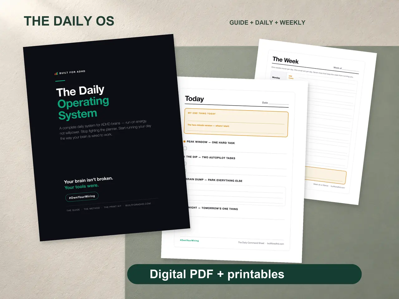
A quick honesty note: the PDF interiors are light, not dark. That’s deliberate. These are systems you print and write on, and a dark page on paper means a soaked ink cartridge and gray smudges. So the interiors use the same low-noise philosophy — generous white space, minimal borders, nothing competing for attention — optimized for paper. The covers and the website are where the dark design lives. Same principle, right medium for each.
For everything else you read on screen
You can’t redesign every document, but you can lower the visual baseline:
- Read PDFs in your viewer’s dark or “night” mode where available
- Turn down the brightness on dense, bright documents
- Keep one clean, low-clutter page in front of you instead of ten busy ones
It’s not as refined as a purpose-built dark layout, but it helps.
Your entire screen
Beyond individual sheets, consider dark mode for everything:
- OS-level dark mode (macOS, Windows, iOS, Android all support this)
- Browser dark mode (Chrome, Firefox, Safari all have it)
- Night Shift / blue light filter — reduces blue light emission, especially important for late-night brain dumps
Monitor settings
If you work at night (and many ADHD adults do — we’re night owls), reduce your monitor brightness to 30-50%. The combination of dark mode + reduced brightness dramatically reduces visual overstimulation.
Why Most Planners Don’t Do This
Most planners are visually noisy because noisy is the default. Designing a genuinely low-noise layout — on screen or on paper — takes real effort. It’s easier to drop content onto a dense grid and ship it.
But for ADHD brains, the container matters as much as the content. A perfect task management system on a bright white page is still going to overwhelm you before you write anything.
Every Built for ADHD product — the Daily OS, Budget Reset, Hyperfocus Playbook, Family Command Center, and Wind-Down — is designed low-noise: a dark, calm website to browse and buy on, and light, print-friendly PDF interiors built for the medium they actually live on — paper. Not because it looks cool (it does), but because it reduces the cognitive cost of just getting started.
And for ADHD brains, reducing the cost of starting is half the battle.
Related: low visual noise is one of the design rules behind all of the ADHD tools that actually work for our brains.